Flash Cardiac

This project was meant to introduce me to important terms, tools and techniques in the field of User Experience Design, by researching, and designing a mobile application. The goal of the course project was to practice these skills using the Design Thinking Process, adapted from Paris-Est d.school at Ecole des Ponts.
The objective was to empower people to learn new vocabulary by creating a mobile application with the following features: An onboarding page, a way to sign-up and log in, an admin area, a menu, a way to upload new vocabulary words and definitions and a means of reviewing vocabulary.
Tools
Adobe XD
Wireframes, mock-ups
InVision
Prototype for user testing
Photoshop CC
PowerPoint 2016
Discovery
Competitor Analysis
I started by following the exercises of the UX Fundamentals course. After being introduced to general UX and UI principles, a competitor analysis and evaluation was conducted. The first challenge I ran into was finding the right competitors. In a first step, possible competitors were identified by searching the App Store for the terms vocabulary and flashcards.
After downloading and starting every app, all those that are restricted to language learning were eliminated from the list of competitors, e.g. Babbel. For competitor analysis, Brainscape, Buffl, and Brainyoo were chosen.
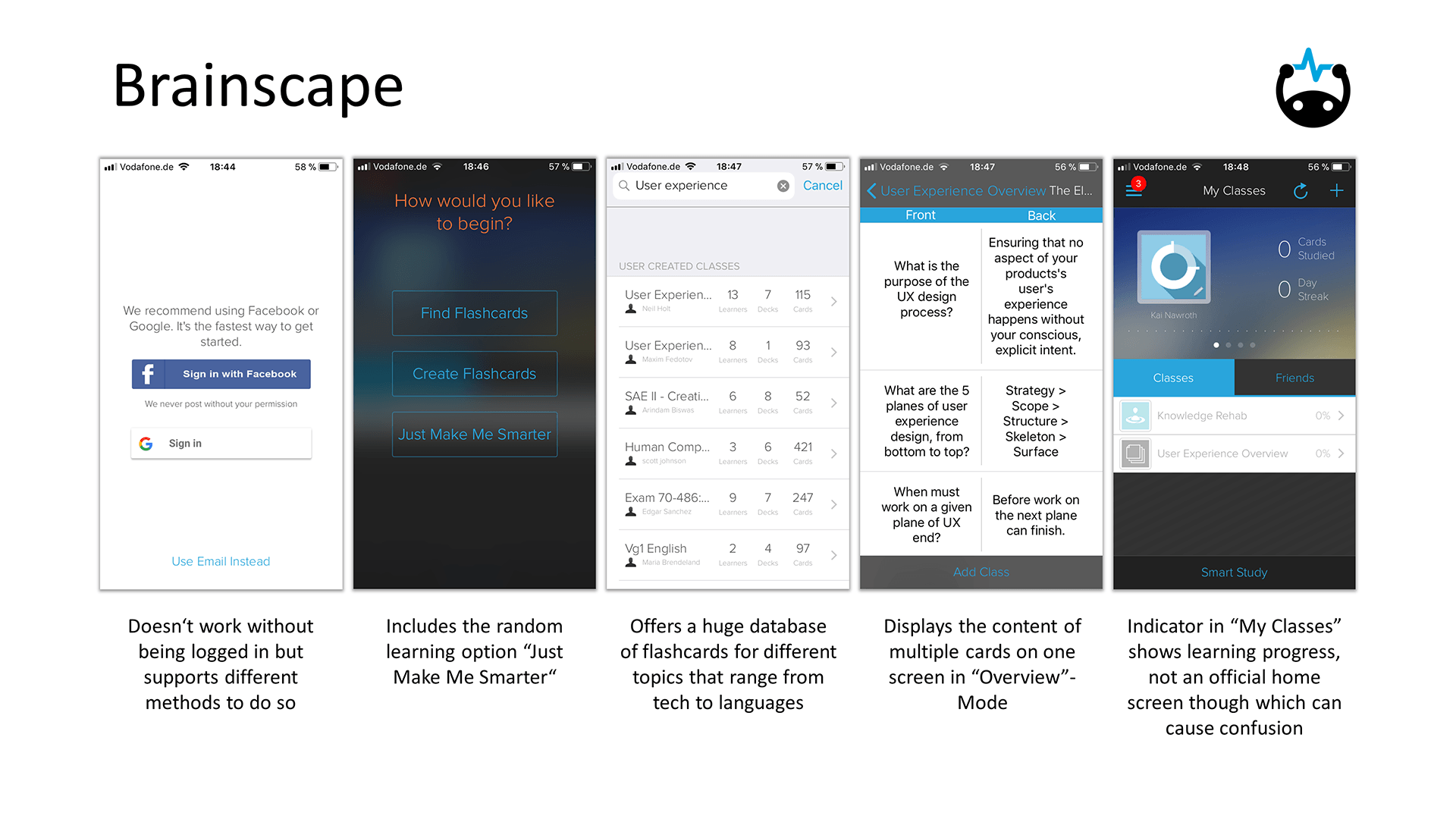
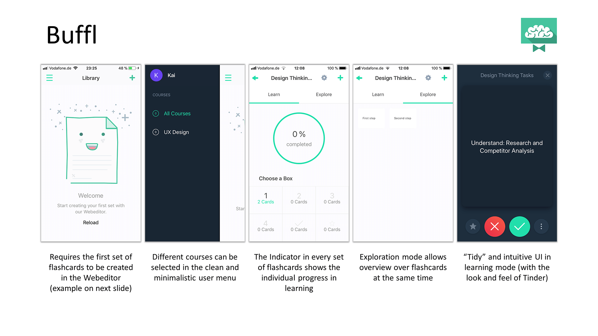
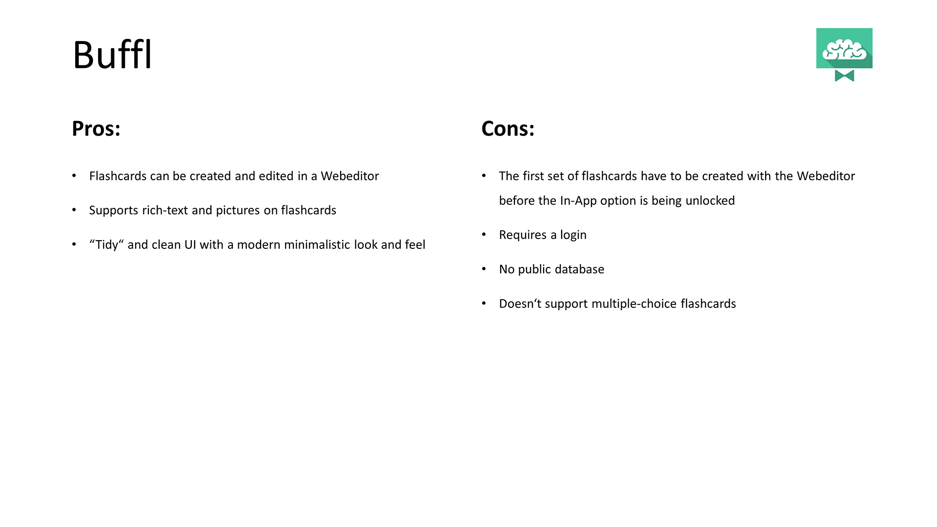
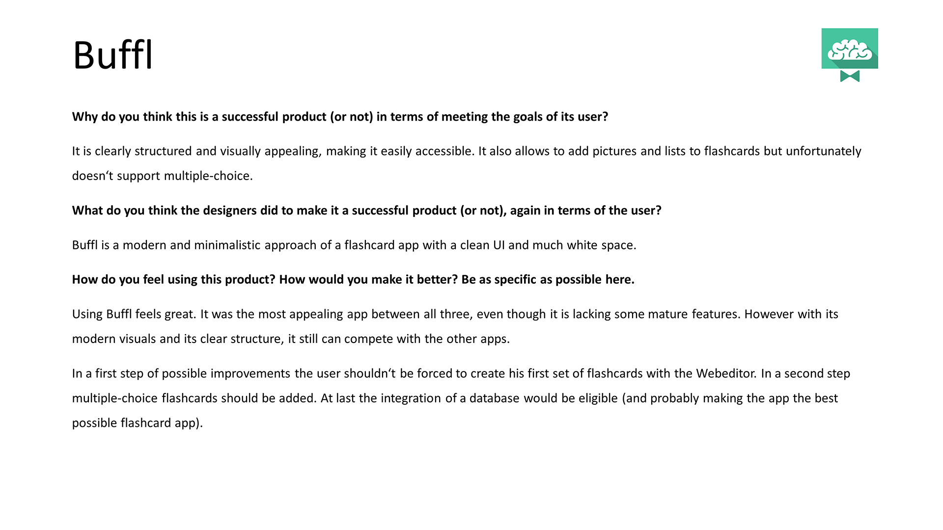
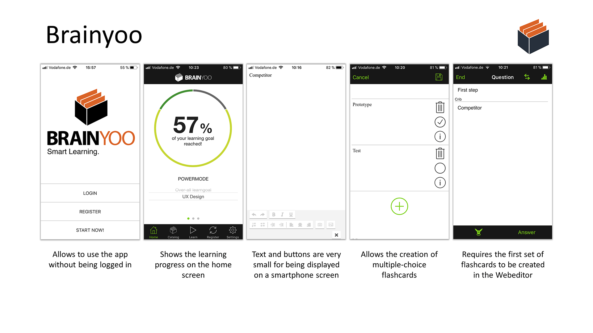
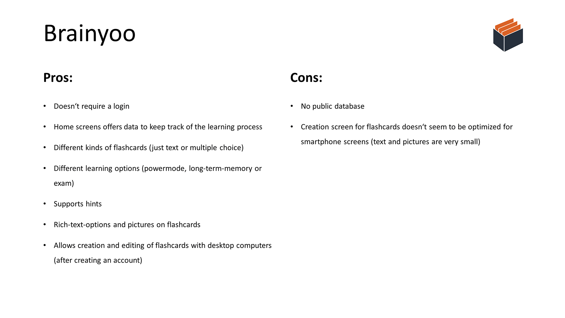
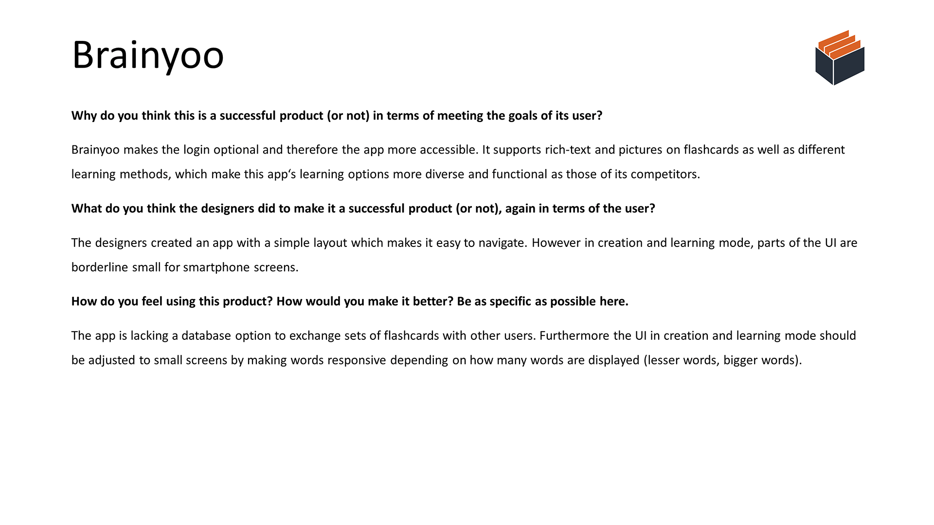
Accessibility plays a key factor in UX, making the login function a positive attribute, although I really appreciate the skip option, allowing users to use the app without creating an account and/or entering personal information.
Usability is another important factor. If an app isn’t easy to use, it’s unlikely that the app is actually being used. Intuitive menus and functions that don’t require much (or any) explanation are mandatory.
Findability is part of Peter Morville’s User Experience Honeycomb. Brainscape’s missing home screen is therefore a negative attribute since it can lead to some confusion, because the user is missing a starting point.
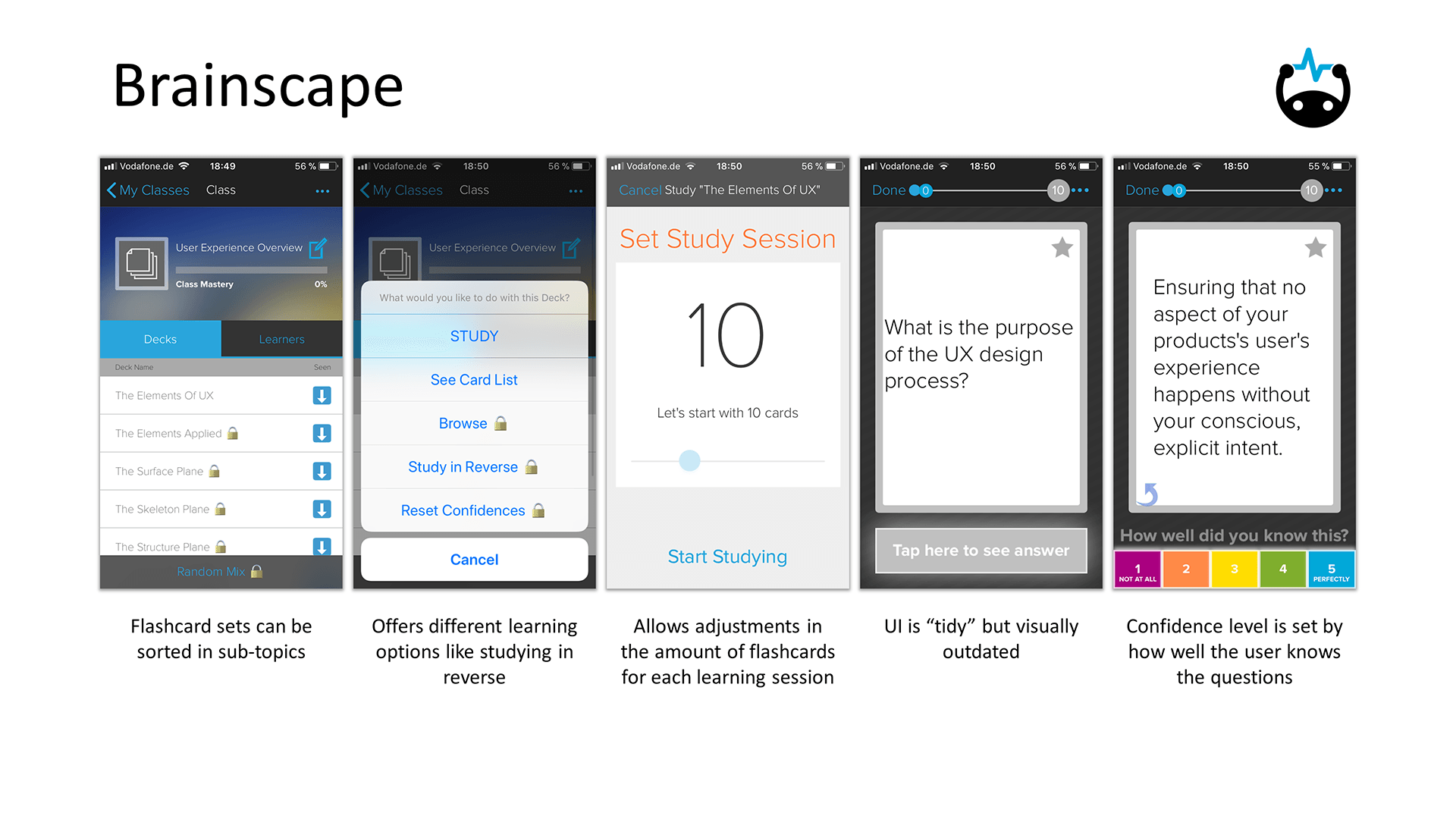
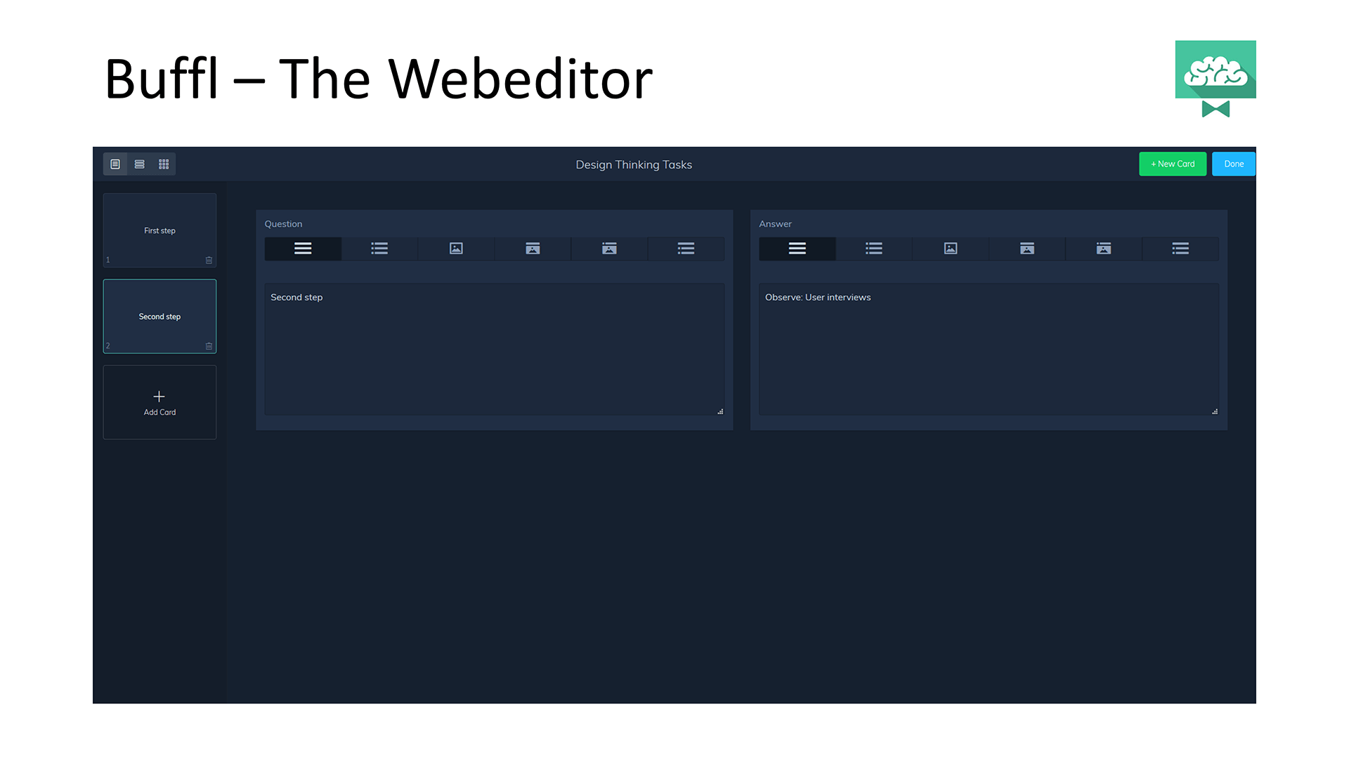
Desirability is a lot about UI. Especially Buffl with it’s clean UI has a very good look and feel that even outweighs some missing functions. In comparison, Brainscape’s presentation is quite outdated and clearly a negative attribute.
Usefulness is probably the most important factor. All apps come with the basic function of creating flashcards but some do even more, such as Brainscape with its database or Brainyoo with its multiple-choice flashcards.
User Research
User Interview Questions
- Tell me about yourself. Are you a student or a working professional? Tell me more about your daily routines.
- What motivates you to learn new vocabulary in languages or for professions?
- If you had to learn a new language or profession, what would you use to do so and why?
- What is the biggest challenge when learning something new?
- What features made the apps you’ve used so far easy or difficult to use?
- Is there something that could have made it easier for you?
- What features do you think would be most useful to you in a flashcard app?
Conclusion
Doing Theme
- They learn new things preferably online.
- They use apps to learn languages (at least to support other courses).
- They make use of voice features.
Thinking Theme
- They think getting started is the most difficult part of learning something new.
- They think a scan or text recognition feature would be handy.
- They think flashcards should be freely designable (changing font, adding pictures, drawing on the screen etc.).
- They think words should be repeated (how often is depending on how good you knew the answer).
Feeling Theme
- They like to learn new things.
- They like to improve existing skills.
- They feel like missing motivation is the biggest challenge.
Concepting
User Stories
- As somebody living in a big city, I spend a lot of time on public transport that I can use to learn something new by using my phone.
- As a busy person, I want to save time when copying the content that I have to learn (e.g. to flashcards).
- As somebody with hobbies such as playing basketball or videogames, I’m often lacking the motivation to start learning.
Job Stories
- When getting into a new topic in university, I really want to know the technical terms by heart.
- When I’ve learned something new, I want to repeat it over and over again in order to memorize it.
- When I’m learning, I easily get distracted by notifications on my phone.
Context of Problem
Problem Statements
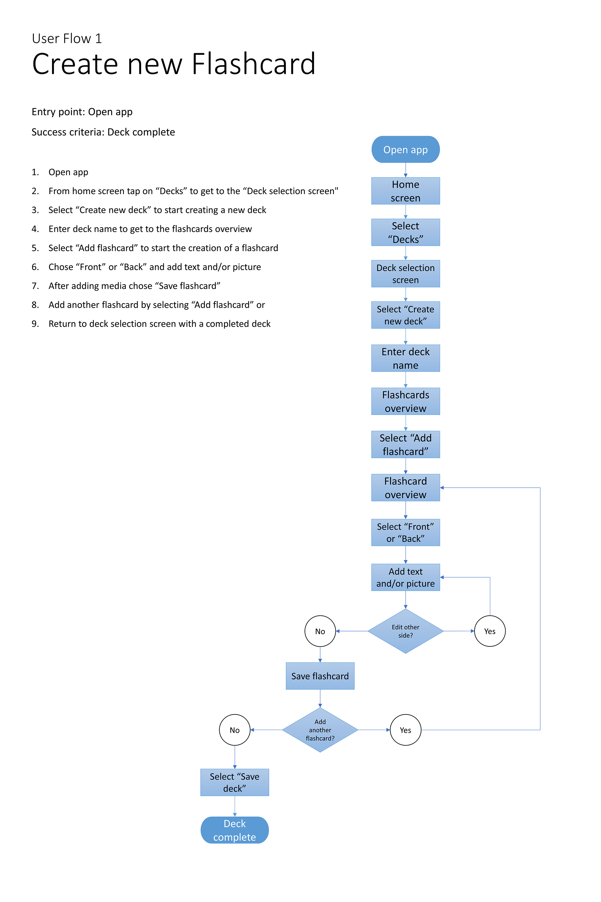
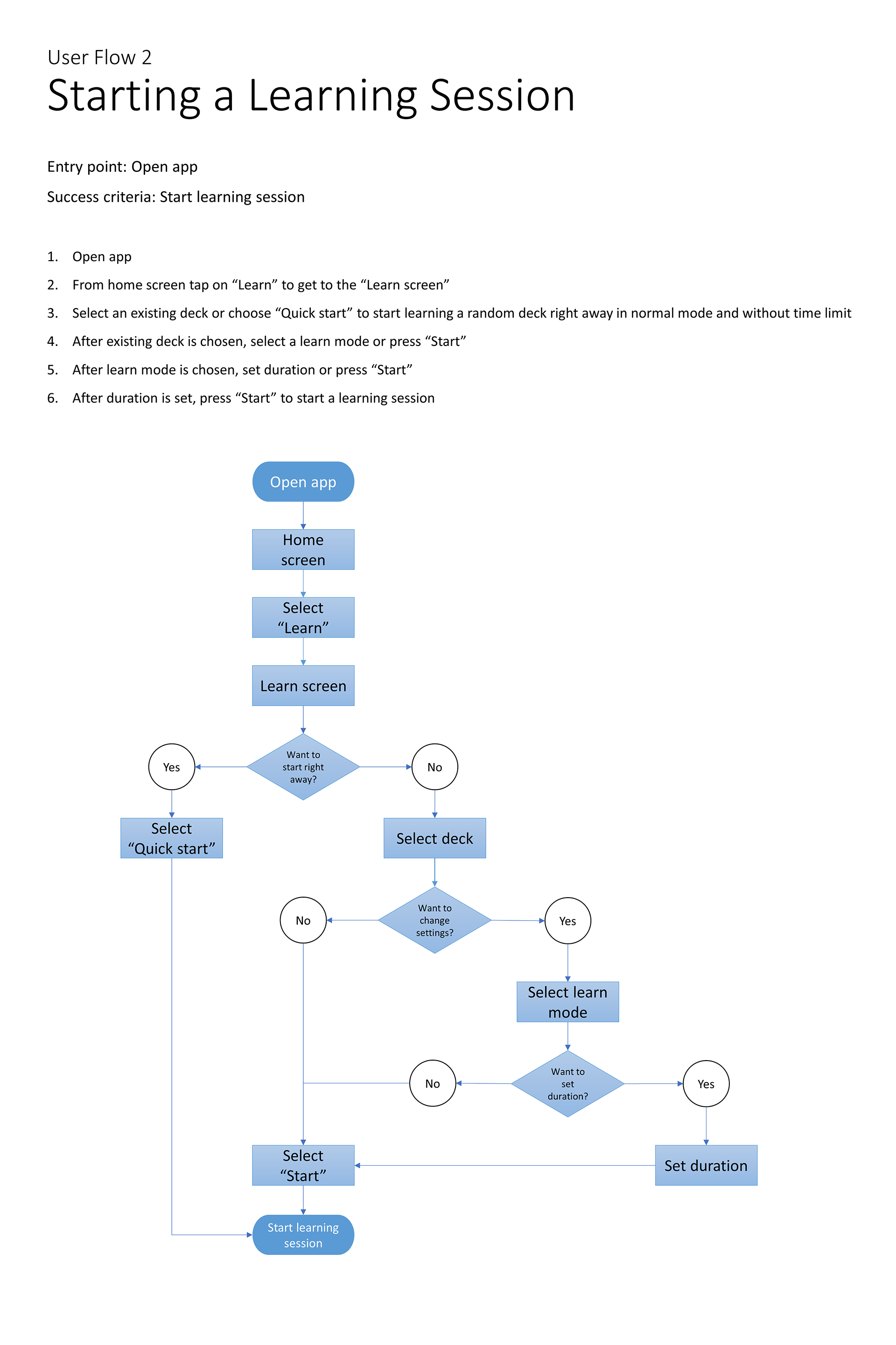
User Flows
Prototyping
Sketching
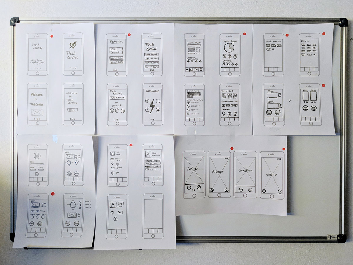
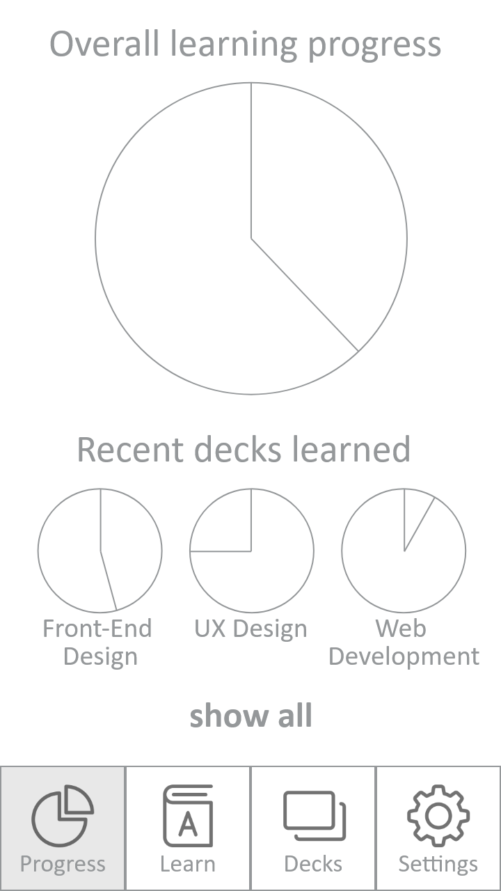
Mid-Fidelity

User Testing
Three usability tests were conducted in person. All three participants tested the mobile application on an iPhone 5S, using the Prott application.
Metrics
Jakob Nielsen’s error severity rating
0 = I don’t agree that this is a usability problem at all
1 = Cosmetic problem only: need not be fixed unless extra time is available on project
2 = Minor usability problem: fixing this should be given low priority
3 = Major usability problem: important to fix, so should be given high priority
4 = Usability catastrophe: imperative to fix this before product can be release
Results
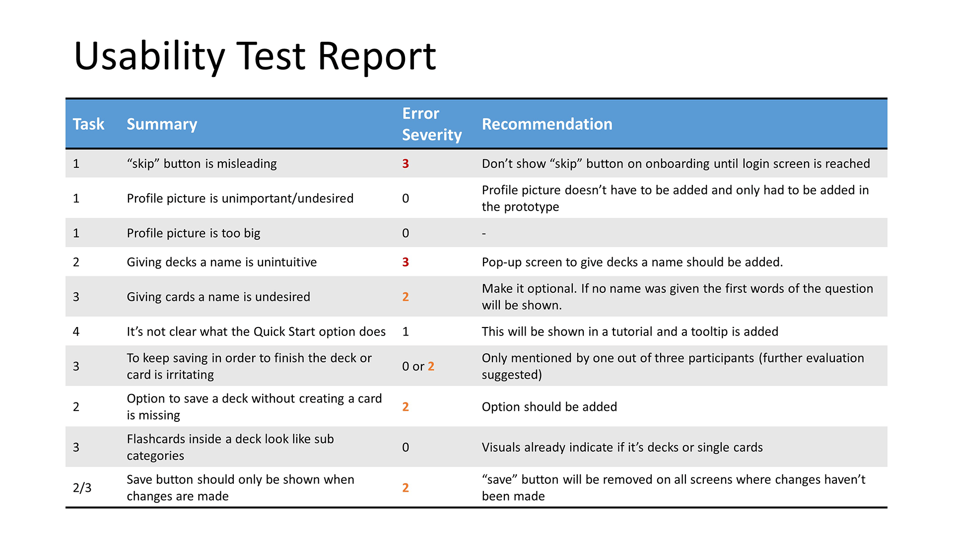
Conclusion
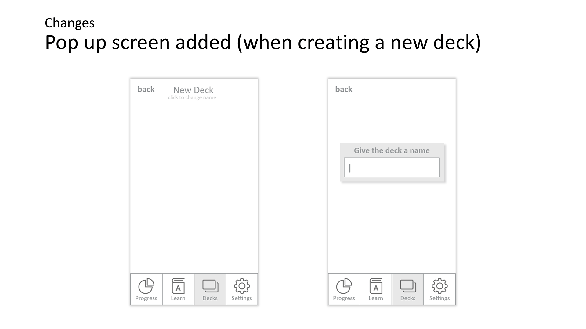
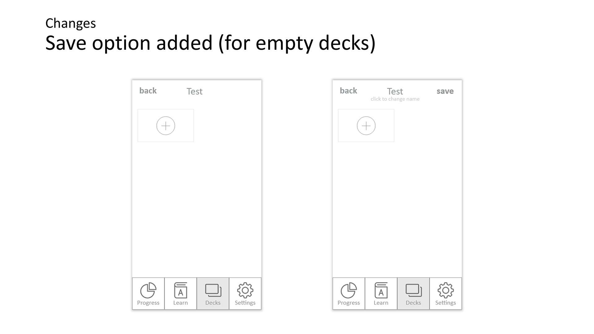
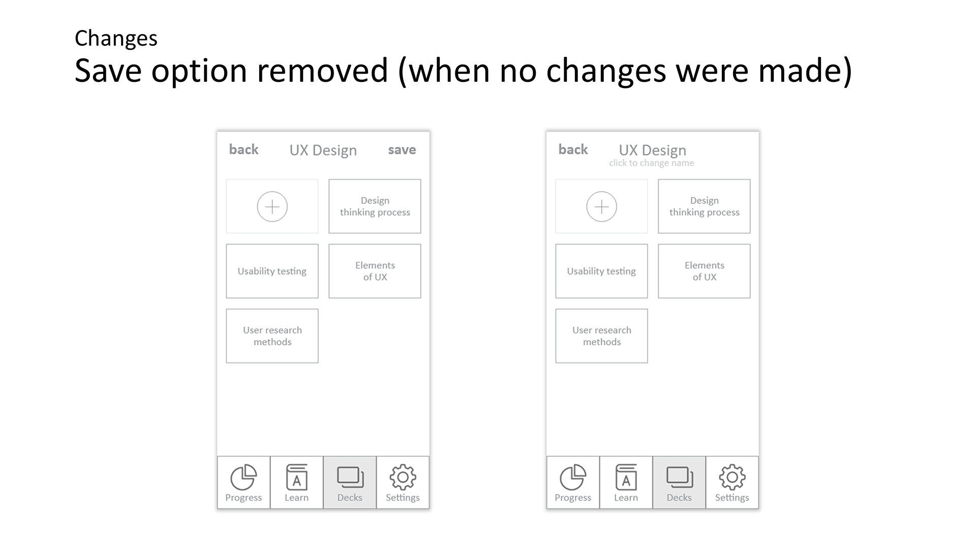
Overall the Prototype did pretty well, but in order to deliver a better user experience the following changes were made:
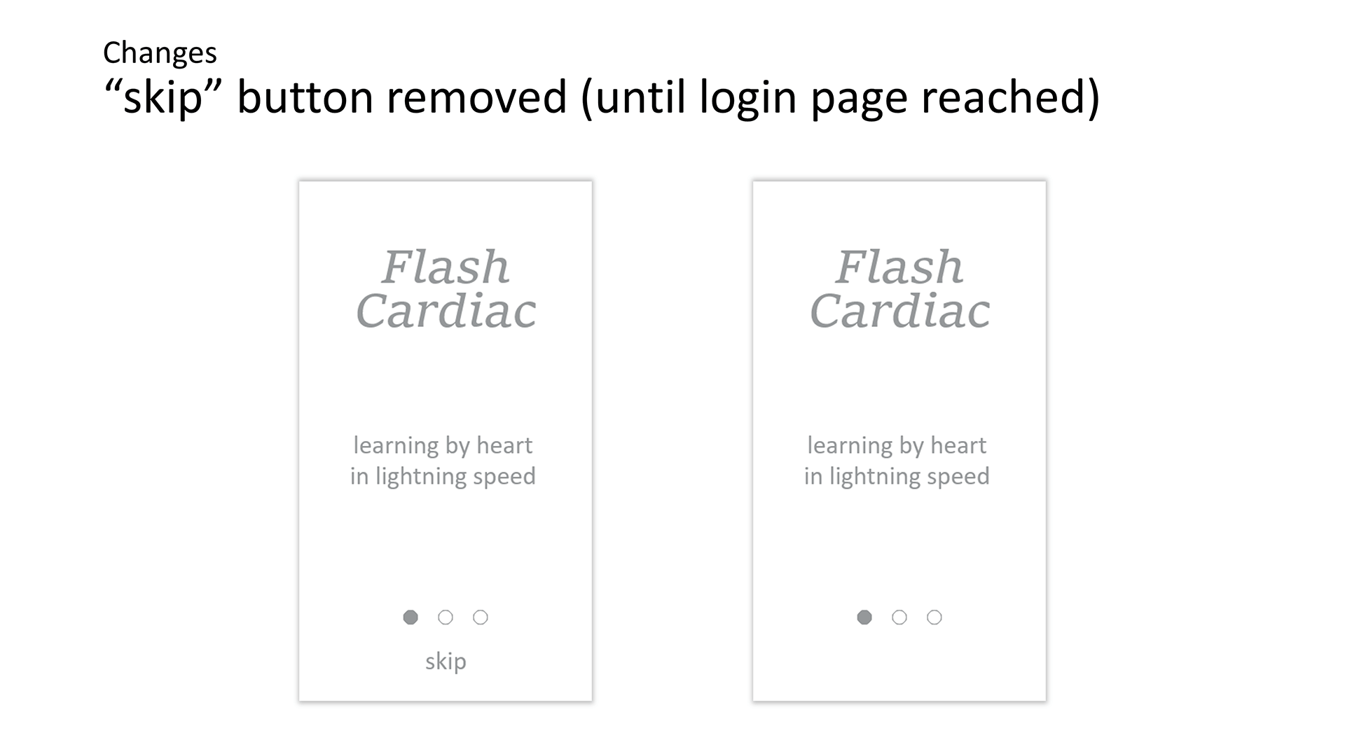
- Skip button was removed from the onboarding (until login page)
- Pop up to give name was included to reduce the interaction needed in order to complete the deck creation
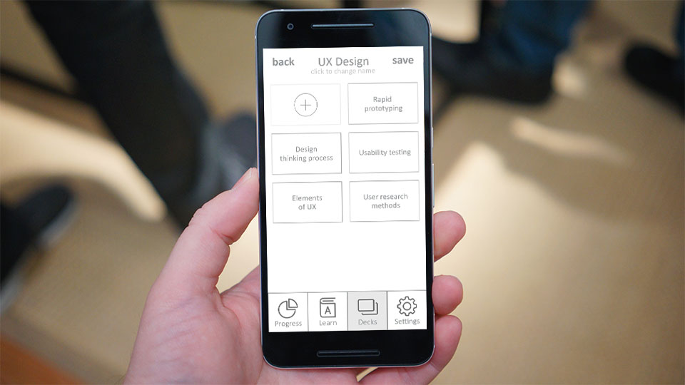
Working Prototype
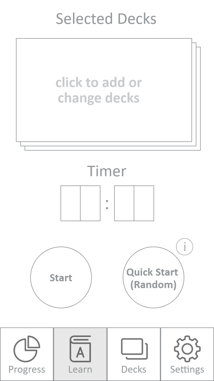
Tasks
- Go through onboarding and create a profile
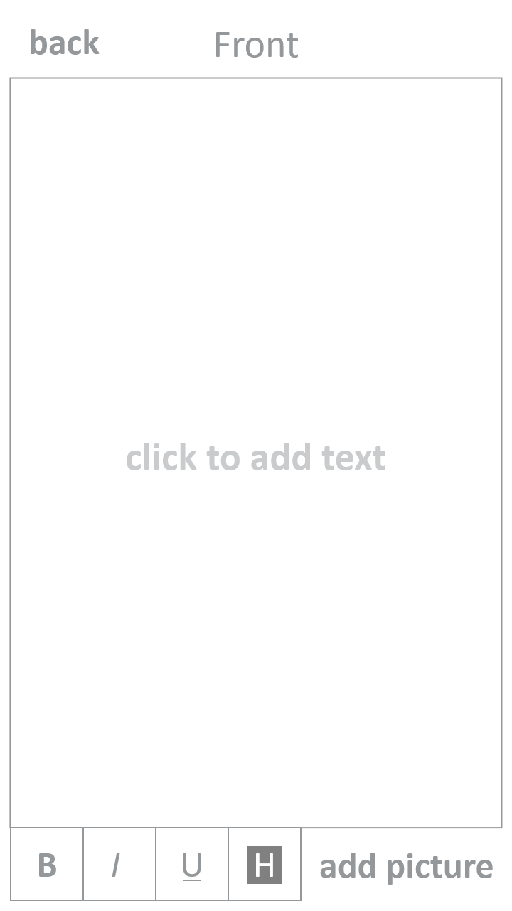
- Add a new deck of cards
- Add a card to an existing deck
- Choose a deck, set a timer and start learning